A dashboard for a life — the method behind the numbers
This is a draft. Notes for you are in the first block — delete it before publishing.
For a few years I had a problem that sounds like greed and was really the opposite: I had too many places where my life was being recorded, and nothing that showed me the whole of it. A weight in one app. Sleep in another. Money in a third. Projects in a fourth. Journal entries in a fifth, and the things that actually mattered — how a day felt, whether I saw my friends, whether I spent an evening doing something I enjoyed — written down nowhere at all.
Each of those tools was doing its job. Together they were useless, because the question I kept asking was never “what did I weigh on Tuesday” but “am I actually living the way I said I wanted to”. No single app could answer that, and no combination of them would, because none of them shared a definition of what a good week looked like.
So I built the dashboard — and, more importantly, I built the framework underneath it first. That order is the whole point of this post.
Three systems, not one
The mistake I nearly made was treating this as a software problem. It is not. A dashboard without a definition of success is a very expensive way of displaying numbers, and it will happily show you a beautiful green bar for a goal you never chose.
So there are three separate things, and they do three different jobs:
- The North Star — what I want across every part of my life, and how I will measure it. This is the source of truth for direction, and it changes rarely.
- The execution engine — projects, as the vehicles that carry a key result forward. Naming, tracking, pipeline. This changes constantly.
- The dashboard — the proof. It visualises progress and refuses to hide a bad week.
The flow runs in one direction and then loops: define objectives → they cascade into key results → projects carry the work → the dashboard tracks it → I review and adjust → repeat. Three artifacts, three altitudes of the same intention.
Altitude matters more than detail
Aim too high and nothing is measurable. Aim too low and everything is, but none of it adds up to anything. So the framework works at three altitudes at once:
- Lifetime — the direction, stated once, in a sentence I would still sign off on in ten years.
- Five years — strategic goals. Concrete enough to argue about, distant enough not to micromanage.
- This year — objectives with quarterly checkpoints. This is the only altitude the dashboard tracks, and that restraint is deliberate. A dashboard that tries to measure a lifetime becomes a horoscope.
The idea that made the key results actually work
Every metric carries a type, and the type decides the arithmetic. This sounds trivial and it is the difference between a dashboard you believe and one you learn to ignore:
- Journey — you have a starting point and a destination, and progress is the distance covered. Weight, for example: it has a baseline, so the bar means something immediately.
- Habit — a count over a rolling window. Days I did the thing, not a ratio of how well.
- Threshold — met or not met, with over-performance shown plainly. Some things have no gradient: you either did it or you did not.
- Ratio — a plain proportion, for anything counted from zero.
- Milestone — discrete, sequential completion. It only ever moves forward, because you cannot un-complete a step, and it flags itself when it has gone quiet.
Two of those rules earned their place the hard way. The first is that a lower number is sometimes the better one — weight, cholesterol, sweets — and if the arithmetic does not know that, a bar will show you a triumphant 90% for a goal you are moving away from. The second is subtler, and I think it is the most valuable single hour I spent on this project.
The goal and the green bar are not the same thing
I had a metric I believe in — fourteen hours of fasting on most days — and I set the target at fifteen days out of fifteen. Perfect. And then it sat there, permanently red, permanently demoralising, and completely uninformative, because a target that demands a flawless fortnight is not a target. It is a way of guaranteeing you never once get the satisfaction of hitting it.
The fix was to separate two things that had been tangled together: the goal, which stays aspirational and stays visible, and the bar that turns the metric green, which is set where a genuinely good fortnight lands. The goal is still fifteen. Green arrives at eleven. The label still reads “eleven of fifteen”, so the ambition is never hidden — but the bar now means something on an ordinary human week.
I would recommend this to anyone building one of these. If a target is unreachable, you stop reading it, and a metric you do not read is worse than no metric at all, because it gives you the feeling of measurement without the substance.
Rules that keep it honest
Everything about this dashboard is arranged around one requirement: it must never flatter me. A few decisions that follow from that.
- Nothing is hand-set if it can be derived. Each dimension reports a status worked out from progress and confidence rather than typed in by me, because the moment I can set my own status I will set it generously.
- If it cannot be measured, it is marked as such. Some things need my judgement and cannot be counted by a machine. Those are labelled honestly instead of being dressed up with an automated-looking number that means nothing.
- Absence is not always a zero. A day I did not record is not the same as a bad day, and conflating the two turns a quiet week into a false verdict. Wherever this distinction exists, the dashboard states the coverage alongside the score — “this many of these days were logged at all”.
- The software is not allowed to decide what my words meant. Several early versions counted a word as an event. Recording that I had avoided something counted as having done it. Writing about a rule counted as breaking it. Every one of those was fixed by making the detector more careful, not by changing the number it produced.
The nine dimensions
Every objective lives in one of nine areas. I did not choose nine because it is a good number — I split them this way because the previous version of my life had them blurring into each other, and things that blur cannot be improved.
| Dimension | What it covers | An example key result |
|---|---|---|
| 🏋️ Health & Vitality | Physical health, energy, exercise, weight, sleep | Reach target weight — 85 kg, from a 92 kg baseline |
| 🧘 Mental Wellness | Meditation, gratitude, positivity, mood, emotional regulation | Mood at 7 or above, on 15 days out of 15 |
| 👨👩👧👧 Family & Social | Family, friends, community | Quality family interactions, 11 days in a rolling fortnight |
| 💰 Financials & Real Estate | Net worth, portfolio, properties, rentals | Income exceeds expenses by 5%, and the surplus goes to investments |
| 🖥️ Tech & Digital Life | Homelab, projects, learning, automation | No more than 5 active tech projects at once |
| 💼 Work & Career | Consulting, mentoring, professional growth | Three quality mentoring sessions a week |
| 🧠 Personal Development | Emotional intelligence, comfort zones, learning | Five hours a week of deliberate learning |
| 🏖️ Leisure & Travel | Cooking, reading, films, trips, hobbies | Protect the time. No guilt, and no reaching for what’s next |
| 🏠 Home & Life Admin | Household, maintenance, admin, organisation | Deliberately none — watched, but not scored |
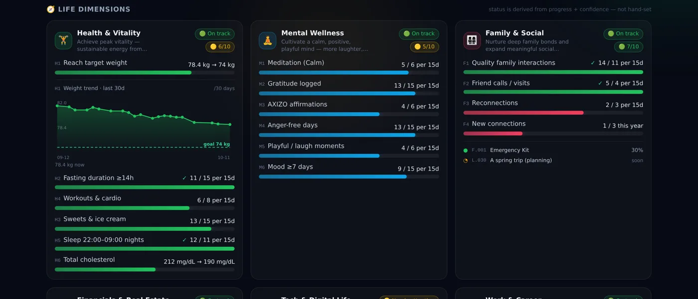
Home & Life Admin carries no key results on purpose. It holds the maintenance and admin work — warranties, renewals, repairs — and it is visible and tracked, but not scored. Not everything worth watching deserves a target, and pretending otherwise produces a number that only looks meaningful.
Leisure & Travel is the same admission in a different form. Its method there is a mindset rather than a metric: enjoy the downtime in the here and now, with no guilt and no reaching for the next thing. You cannot count that honestly. So I don’t.
How the objectives are written
The method is the one Intel used and Google popularised — objectives and key results — and it works better for a person than for a company, for one reason: nothing is hidden from you by an org chart.
| Element | What it means |
|---|---|
| Objective | Qualitative, inspirational. What you want to achieve. |
| Key Results (3–5) | Quantitative, measurable. How you know you are getting there. |
| Initiatives | The projects and tasks that drive a result. What you actually do. |
| Stretch goals | Objectives should feel 60–70% achievable. Uncomfortable, but possible. |
| Confidence | 1–10 on how likely you are to hit each result. A falling score means change something — not work harder. |
| Cadence | Lightweight weekly check-ins; results reset each quarter. |
| Transparency | All of it in one place, no silos — including the ones you keep from yourself. |
The point that took me longest to accept is the stretch rule. If every objective is comfortably reachable you have written a to-do list, not a set of goals. Hitting 70% of something ambitious tells you more than hitting 100% of something safe — which is why the scoring guide reads the way it does. A score in the seventies is not a near miss. It usually means the target was set where it should have been.
| Score | What it means |
|---|---|
| 100% | Achieved as stated |
| 70–99% | Substantial progress; worth recalibrating |
| 40–69% | Partial; needs a review |
| 0–39% | Off track — find the root cause rather than pushing harder |
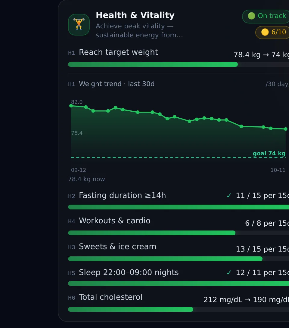
Each dimension also carries a confidence score from one to ten, reviewed weekly and deliberately not the same thing as progress. Progress tells you where you are. Confidence tells you whether you believe you will get there — and confidence falling while progress rises is the most useful early warning the system produces.
How it is built
The dashboard is a small single-page application: React, compiled by Vite, styled with Tailwind. There is no database. All of the state lives in a handful of plain JSON files, which is a deliberate choice rather than a shortcut — the data is readable, comparable over time, and mine, and I can see exactly what the dashboard believes at any moment by opening a text file.
That JSON is bundled into the application when it is built, so the served page is static and fast and all the arithmetic happens in your browser. The progress engine is a single module that takes a key result and returns a percentage, a colour and an explanation, with the formula chosen by that result’s type — journey, habit, threshold, ratio or milestone. That separation is the difference between a dashboard you trust and one you quietly stop reading.
- No charting library. The weight trend is hand-drawn as inline SVG in about a hundred lines. One chart did not justify a dependency, and the goal line has to be drawn even when it is far away — which is precisely when an auto-scaling library would have hidden it.
- Verification is part of the pipeline, not an extra. The build refuses to deploy if too few pages were produced, because a silent failure and a success used to look identical from the outside. Twice.
- Nothing is derived twice. If a number can be computed, it is computed. Hand-typed status is how a dashboard starts lying to the person who made it.
How it updates itself
A dashboard you have to feed is a dashboard you will abandon, so almost nothing here is entered by hand. The flow is one-directional and runs on its own schedule.

A daily job reads the inputs, computes the results, writes the JSON and rebuilds the page. A second, weekly job does the slower work: confidence scores, targets that need revisiting, and anything that has quietly gone unused.
- The daily journal. A note I write anyway is the input for several metrics. The parser reads defined fields — weight, sleep, mood, fasting — and counts specific words in the body text for the habits. I write normally; the dashboard reads it.
- Activity and body data. Exercise days and body measurements arrive from the device I already wear and the scale I already stand on. The scale has its own guard: a reading more than ten percent away from the last accepted one is flagged and excluded rather than allowed to distort the trend — a scale cannot tell a guest or a suitcase from me.
- The finance system. The budgeting tool I run feeds the financial results directly, read-only, so the money side cannot drift from the numbers I actually manage.
- The project tracker. The count of work genuinely in progress comes from my project database rather than my optimism. This was the fix that mattered most: the one hand-typed result was also the one that could lie, and it now fails visibly when I take on too much.
- Two small physical tags. One by the bed, one on the work laptop. A single tap logs a night’s sleep or a working day. This is the least impressive thing in the whole system, and it fixed a metric I had failed to record for months — purely by removing a decision from my evening.
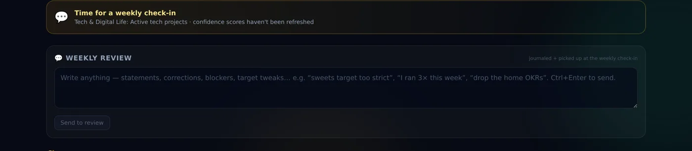
There is one deliberate exception to the automatic rule. A few things genuinely cannot be measured by a machine, and rather than invent a detector that looks automated and means nothing, those are marked as needing my judgement. Some metrics cannot be automated, and pretending otherwise is worse than admitting it. A metric that looks fed but is empty is more dangerous than an obviously manual one.
The dashboard itself
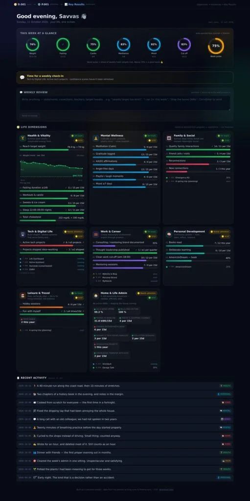
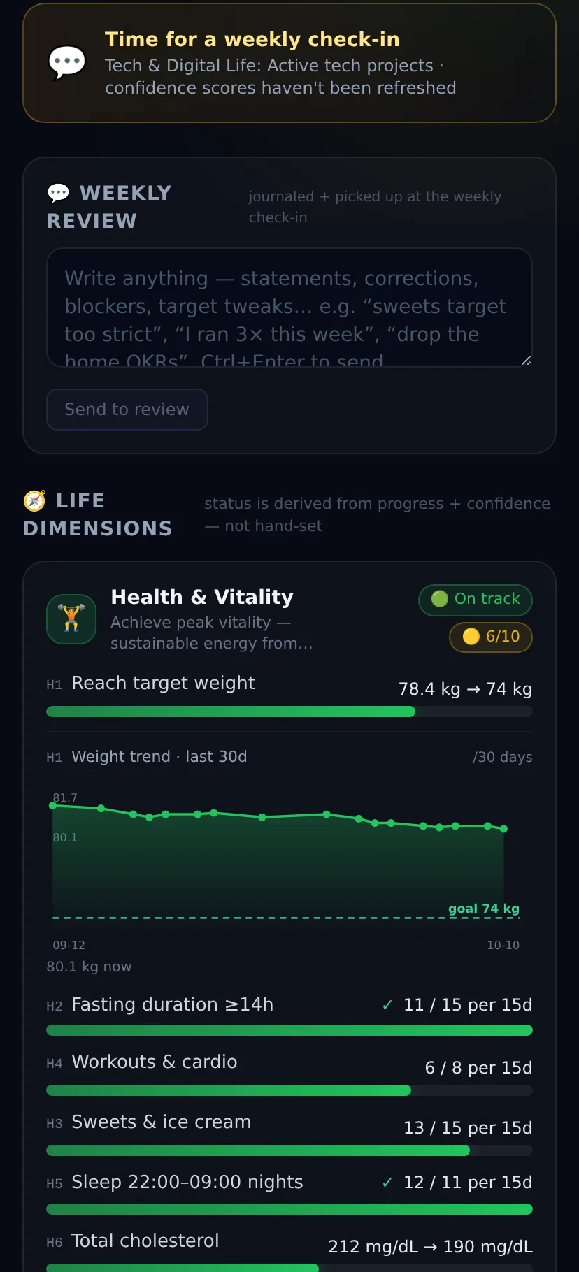
Every screenshot here is from a demo instance with entirely synthetic data — the weights, the metrics and the days are invented.
What I would tell anyone building one
Define the goal before you write the software, or you will build an instrument that measures nothing in particular. Keep the number of metrics small enough that you read them all. Separate the goal from the green bar. And assume you will lie to yourself through the interface unless the interface makes it hard — every honest feature I added came from catching the dashboard telling me something comfortable that was not true.
It is a strange thing to build: a mirror that reports back whether you are living the life you said you wanted. Mine is still not finished, which I have come to think is the correct state for it.